
Choosing the Perfect Paint Color for Your Room Transformation
- rankinpainting610
- Feb 10
- 4 min read
Choosing the right paint color can completely change the feel of a room. It affects mood, perception of space, and even how much natural light the room seems to have. But with so many colors and finishes available, picking the perfect one can feel overwhelming. This guide will help you navigate the process with practical tips and examples so you can confidently select a color that suits your style and space.
Understand the Room’s Purpose and Mood
The first step is to consider how you use the room and what kind of atmosphere you want to create. Different colors evoke different feelings:
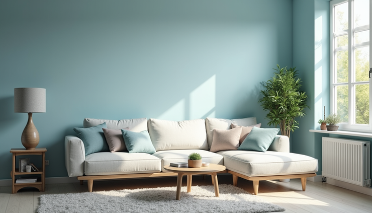
Calming and Relaxing: Soft blues, greens, and neutrals work well in bedrooms and bathrooms.
Energizing and Stimulating: Bright yellows, oranges, or reds can add energy to kitchens or workout spaces.
Warm and Cozy: Earth tones like warm browns, deep reds, and muted oranges create a welcoming vibe in living rooms.
Clean and Modern: Whites, grays, and cool tones suit minimalist or contemporary spaces.
Think about the activities that happen in the room and choose a color that supports those activities. For example, a home office might benefit from a color that promotes focus, such as a soft green or blue.
Consider Lighting Conditions
Lighting dramatically changes how paint colors appear. Natural light, artificial light, and the direction your windows face all influence color perception.
North-facing rooms get cooler, indirect light, which can make colors look bluer or duller. Warm colors like soft yellows or warm neutrals can balance this.
South-facing rooms receive bright, warm light, making colors appear more vibrant. Cooler tones like blues and greens work well here.
East-facing rooms get morning light, which is bright and warm, while west-facing rooms get softer, warmer light in the afternoon.
Test paint samples on different walls and observe them at various times of day. This helps avoid surprises once the entire room is painted.
Use Color Samples and Test Patches
Never rely solely on paint chips or online images. Colors can look very different on a large wall compared to a small sample. Buy small sample pots and paint patches on your walls. Live with these patches for a few days to see how they look in different lighting and with your furniture.
Try painting a large enough area, at least 2 feet by 2 feet, so you can get a true sense of the color. Also, observe how the color interacts with your flooring, curtains, and décor.
Balance Bold and Neutral Colors
If you want to use a bold color but worry it might overwhelm the room, balance it with neutrals. For example:
Paint three walls a soft neutral and use a bold color on one accent wall.
Use bold colors on smaller areas like a closet door, built-in shelves, or trim.
Pair bright colors with whites, grays, or beiges to keep the space feeling open.
This approach allows you to enjoy vibrant colors without feeling trapped by them.
Understand Color Psychology
Colors influence emotions and behavior. Here are some common associations:
Blue: Calm, trustworthy, and serene. Great for bedrooms and bathrooms.
Green: Refreshing and natural. Works well in living rooms and kitchens.
Yellow: Cheerful and energetic. Ideal for kitchens and playrooms.
Red: Passionate and stimulating. Use sparingly in dining rooms or accents.
Gray: Neutral and sophisticated. Fits modern or minimalist designs.
White: Clean and spacious. Good for small rooms to open them up.
Use these associations to guide your choice but remember personal preference matters most.
Match Paint Finish to Room Use
Paint finish affects both appearance and durability:
Matte or flat finish: Hides imperfections but is less washable. Good for ceilings and low-traffic areas.
Eggshell: Slight sheen, easy to clean, suitable for living rooms and bedrooms.
Satin: Smooth and durable, works well in kitchens and bathrooms.
Semi-gloss and gloss: Reflective and easy to clean, ideal for trim, doors, and high-moisture areas.
Choose a finish that fits the room’s function and your maintenance preferences.
Coordinate with Existing Elements
Consider your furniture, flooring, and décor when selecting paint. A color that clashes with your existing style can create visual tension. For example:
Warm wood tones pair well with warm paint colors like beige, cream, or soft terracotta.
Cool-toned furniture looks great with blues, grays, or crisp whites.
Patterned rugs or upholstery can inspire your wall color choice by pulling a subtle shade from the pattern.
If you plan to change furniture later, choose a versatile color that works with multiple styles.
Use Color Tools and Resources
Many paint brands offer online tools that let you upload photos of your room and try different colors virtually. These can be helpful but should not replace physical samples.
Color swatches, fan decks, and paint chips from stores provide a tactile way to compare shades. You can also visit showrooms or model homes to see colors in real settings.
Avoid Common Mistakes
Choosing colors based on trends alone: Trends change quickly. Pick colors you will enjoy for years.
Ignoring lighting: A color that looks great in a store may look very different at home.
Not testing enough: Small samples don’t show how a color covers or looks on a large wall.
Forgetting about undertones: Some colors have warm or cool undertones that affect how they pair with other colors.


Comments